I had the same idea, but like always the best answer depends on information we don't have about the original data!

Like whats the maximum timespan, number of stores and expected information gain.

I guess that distinguishing up to 20 stores by color or symbols should be sufficient to represent them all into one 2D chart (Sales x Time). Connecting the points might help:

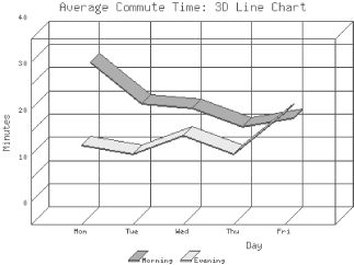
Like here or even with perspective.

All images found by googling for GD:Graph.

Cheers Rolf


In reply to Re^2: Matrix kind of graph by LanX
in thread Matrix kind of graph by jthomas

Title:
Use:  <p> text here (a paragraph) </p>
and:  <code> code here </code>
to format your post, it's "PerlMonks-approved HTML":


  • Posts are HTML formatted. Put <p> </p> tags around your paragraphs. Put <code> </code> tags around your code and data!
  • Titles consisting of a single word are discouraged, and in most cases are disallowed outright.
  • Read Where should I post X? if you're not absolutely sure you're posting in the right place.
  • Please read these before you post! —
  • Posts may use any of the Perl Monks Approved HTML tags:
    a, abbr, b, big, blockquote, br, caption, center, col, colgroup, dd, del, details, div, dl, dt, em, font, h1, h2, h3, h4, h5, h6, hr, i, ins, li, ol, p, pre, readmore, small, span, spoiler, strike, strong, sub, summary, sup, table, tbody, td, tfoot, th, thead, tr, tt, u, ul, wbr
  • You may need to use entities for some characters, as follows. (Exception: Within code tags, you can put the characters literally.)
            For:     Use:
    & &amp;
    < &lt;
    > &gt;
    [ &#91;
    ] &#93;
  • Link using PerlMonks shortcuts! What shortcuts can I use for linking?
  • See Writeup Formatting Tips and other pages linked from there for more info.