From that page:"No offense, but Larry's official Perl6 logo is one of the ugliest logos in the history of logos. Almost every recent, major programming language in the world has a clean and well-designed logo (ruby diamond, python snakes, etc.). And then there's Camelia (which, by the way, is the name of a sanitary napkin here in Germany) which looks like it was done by a 3-year old on LSD who was given a set of crayons with every color in the world. I can already hear the jokes from outside the Perl community: Ah well, now finally your unprofessional logo fits your unprofessional line-noise-like language. Excuse me for getting all emotional but it appears that the core folks still haven't realized how bad Perl's marketing really is/has become. People judge books by their cover and so do most decision makers which dictate what language their company is gonna use. Giving Perl6 an unprofessional, childish appearance with a logo that could well be the logo of a local Kindergarten group isn't gonna help! No matter how likeable and cute it may appear to nerds!"
No lies detected. I thought they were going to swap logos when it became Raku but they kept Larry's MS Paint monstrosity. I'm also kinda surprised the people that worked on it from the early days don't have mild PTSD from seeing the P 6 stamped on Camelia's wings. As a logo, a simple, 'Raku ware' style cup, small tea bowl, sake cup, etc. with a small, gold-filled crack would have been attractive, actually represent the language's namesake, and even given a nod to how much the entire project had been through over the almost 20 years before it became "Raku." The image I've always had in my head is simple enough to scale down to an icon in color and even looks decent in black and white for print. Also would have given devs a canvas to color or decorate the cup in an attractive way to fit their project's style or theme; only requiring the cup's basic shape and crack remain uniform.. I had links to a few old examples I had in mind but can't post links without an account, I guess. Just "Tough beans." when I post. I'd even buy a decent, official Raku lang-themed sake-- uh, I mean coffee cup set to sip 'coffee' from and I don't even write Raku anymore. | [reply] |
| [reply] |
a childish mascot
There is a difference between childish in conception and childish in execution. It is the latter which I feel is more likely to hold Raku back.
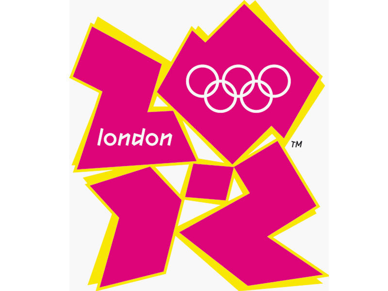
But logos are by their very nature subjective. I well recall being utterly aghast by this (and that was before the cost leaked out). Some people thought it was great.
| [reply] |
To my (non-artistic) mind, it's a pity that these were not developed further and perhaps adopted.
They seem to be very fitting for Perl...
| [reply] |